


As the deadline for Hashnode Hackathon is around the corner, I have decided to spare time to participate in this thrilling event. Hackathons are just the best places for developers to improve and be active in the community. Already looking forward to the next one aaaand lets dive straight into the application!
Why do you even need a password generator?
Every single person who uses the internet has experienced it at least once that you had to use the same password over and over again because you have no idea what your new password should be. Just to make it a little bit easier for you, I have come up with an idea to create a password generator which will clearly generate a password according to your preferences.
I believe users should have different options to include or exclude in their password. For some reason, you might not want to have capital letters or special characters in your password. I will be sure to provide those options for you. Last but not least, I will be using React, because why not, everybody loves React!

Once done with creating a new repository and linking that to Vercel account, I can dive deep into the code. I will be using material-ui for pre-defined components such as button, slider and checkbox which will make things easier for me and I just simply like to play with those frameworks!
Let's install material-ui package first
npm install @material-ui/core
and then create a new component called PasswordGenerator at src/components.
Since I have created a component that all the logic will be stored, I can get rid of everything in App.js and then import the new component.
import "./App.css";
import PasswordGenerator from "./components/PasswordGenerator";

function App() {
  return (
    <div className="App">
      <PasswordGenerator />
    </div>
  );
}

export default App;
Now is the time to start with the magic. Let me create a template in src/components/PasswordGenerator.js by simply importing the desired components from material-ui.
import React from "react";
import {
  Button,
  Card,
  CardContent,
  Checkbox,
  Container,
  FormControl,
  FormControlLabel,
  FormGroup,
  Slider,
  TextField,
} from "@material-ui/core";

export default function PasswordGenerator() {
  return (
    <Card maxwidth="sm" className="generatorWrapper">
      <CardContent>
        <Container className="generatorHeader">
          <h1>Generate Password</h1>
          <FormControl fullWidth>
            <TextField disabled id="standard-disabled" label="Password" />
          </FormControl>
        </Container>
        <Button variant="contained" color="primary" className="generateButton">
          Generate
        </Button>
        <h3>Password Length</h3>
        <Slider
          aria-labelledby="discrete-slider-small-steps"
          step={1}
          marks
          min={12}
          max={36}
          valueLabelDisplay="auto"
          color="primary"
        />

        <FormGroup>
          <FormControlLabel
            control={<Checkbox name="hasSpecialChars" color="primary" />}
            label="Special Characters"
          />
          <FormControlLabel
            control={<Checkbox name="hasCapitals" color="primary" />}
            label="Capital Letters"
          />
        </FormGroup>
      </CardContent>
    </Card>
  );
}
Now that I have a container that holds the password generator, I can simply apply styles:
.App {
  display: flex;
  justify-content: center;
  align-items: center;
  background: radial-gradient(#40404b, #111118) rgba(34, 34, 40, 0.94);
  height: 100vh;
  text-align: center;
}

.generatorHeader {
  margin-bottom: 2rem;
}
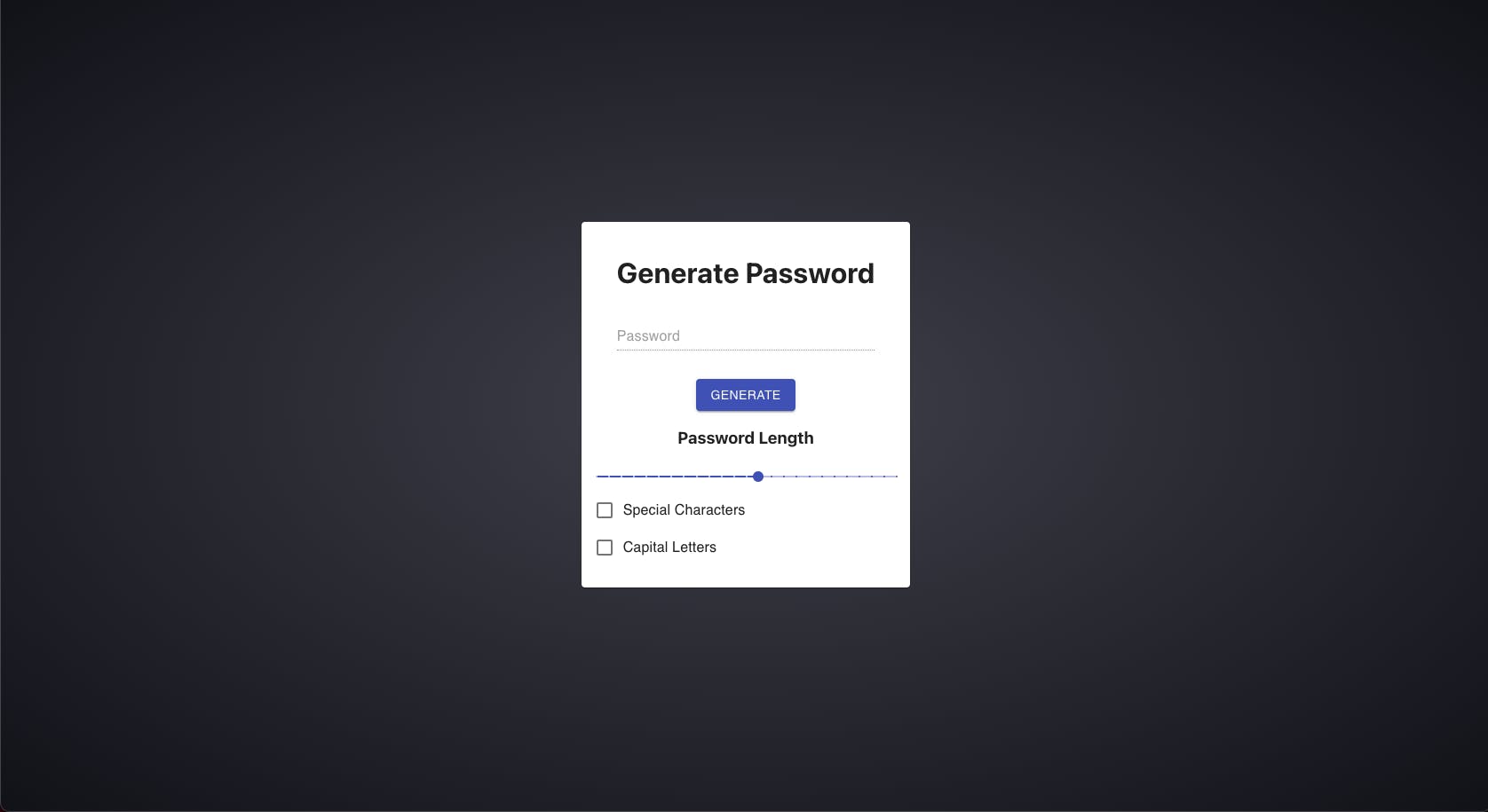
After basic styles I have the following visual:
Okay, styles are there but logic is still missing. First of all, I need to define some default values for checkboxes, slider and input field like so:
  const [password, setPassword] = useState("");
  const [hasSpecialChars, setHasSpecialChars] = useState(true);
  const [hasCapitals, setHasCapitals] = useState(false);
  const [passwordLength, setPasswordLength] = useState(12);
I have set the passwordLength to 12 because I don't want users to set passwords that have less than 12 digits. Right now we have default values, but those are hardcoded and will never change. To allow the user to change those values, we need to add OnChange events:
<Card maxwidth="sm" className="generatorWrapper">
      <CardContent>
        <Container className="generatorHeader">
          <h1>Generate Password</h1>
          <FormControl fullWidth>
            <TextField
              disabled
              id="standard-disabled"
              label="Password"
              value={password}
            />
          </FormControl>
        </Container>
        <Button
          variant="contained"
          color="primary"
          className="generateButton"
        >
          Generate
        </Button>
        <h3>Password Length</h3>
        <Slider
          value={passwordLength}
          aria-labelledby="discrete-slider-small-steps"
          step={1}
          marks
          min={12}
          max={36}
          valueLabelDisplay="auto"
          color="primary"
          onChange={(event, newValue) => {
            setPasswordLength(newValue);
          }}

        />

        <FormGroup>
          <FormControlLabel
            control={
              <Checkbox
                checked={hasSpecialChars}
                onChange={() => setHasSpecialChars(!hasSpecialChars)}
                name="hasSpecialChars"
                color="primary"
              />
            }
            label="Special Characters"
          />
          <FormControlLabel
            control={
              <Checkbox
                checked={hasCapitals}
                onChange={() => setHasCapitals(!hasCapitals)}
                name="hasCapitals"
                color="primary"
              />
            }
            label="Capital Letters"
          />
        </FormGroup>
      </CardContent>
    </Card>
Now states are updated if the user changes any of the default values by interacting with the elements. The only thing left is to add an onClick event to generate button so that we can create a new password for each click.
Let's define a new function called generatePassword to generate random password.
 const generatePassword = () => {
    const upperCase = `ABCDEFGHIJKLMNOPQRSTUVWXYZ`;
    const lowerCase = upperCase.toLowerCase();
    const specialCharacters = `1234567890!"#%^&'()*+,-/;<=>?@[]\\_\`{}|~`;
    let possiblePassword = "";

    if (hasCapitals) possiblePassword += upperCase;
    if (lowerCase) possiblePassword += lowerCase;
    if (hasSpecialChars) possiblePassword += specialCharacters;
    let generatedPassword = "";
    for (let i = 0; i < passwordLength; i++) {
      generatedPassword +=
        possiblePassword[
          Math.floor(Math.random() * Math.floor(possiblePassword.length - 1))
        ];
    }
    setPassword(generatedPassword);
  };
What happens above is that variables are defined with all the possible characters along with an empty variable to store the possible password. Depending on user choice, the desired option will be included in the password. That means, for instance, if the user checked Capital Letters checkbox, then capital letters will be included in the possible password. Which at the end would look like this:
let possiblePassword = `ABCDEFGHIJKLMNOPQRSTUVWXYZabcdefghijklmnopqrstuvwxyz1234567890!"#%^&'()*+,-/;<=>?@[]\_`{}|~`;
This variable holds all the possible characters that can be added to the final result. To get the final version, operate a for loop and generate a random string with the desired length out of possiblePassword. After the operation, set password state to the value we get from generatedPassword.
As function to create a new password is present, I can safely pass this function to the button and also to the slider so that whenever the user changes the slider, a new password can be generated with the desired length.
  <Button
          variant="contained"
          color="primary"
          className="generateButton"
          onClick={generatePassword}
        >
          Generate
        </Button>
Minor edge case here, by comparing the new value of Slider to the old one I can be sure to not generate new passwords if the Slider's value is not changed:
<Slider
          value={passwordLength}
          aria-labelledby="discrete-slider-small-steps"
          step={1}
          marks
          min={12}
          max={36}
          valueLabelDisplay="auto"
          onChange={(event, newValue) => {
            setPasswordLength(newValue);
            newValue !== passwordLength && generatePassword();
          }}
          color="primary"
        />
At the end our component looks like this:
import React, { useState } from "react";
import {
  Button,
  Card,
  CardContent,
  Checkbox,
  Container,
  FormControl,
  FormControlLabel,
  FormGroup,
  Slider,
  TextField,
} from "@material-ui/core";

export default function PasswordGenerator() {
  const [password, setPassword] = useState("");
  const [hasSpecialChars, setHasSpecialChars] = useState(true);
  const [hasCapitals, setHasCapitals] = useState(false);
  const [passwordLength, setPasswordLength] = useState(12);

  const generatePassword = () => {
    const upperCase = `ABCDEFGHIJKLMNOPQRSTUVWXYZ`;
    const lowerCase = upperCase.toLowerCase();
    const specialCharacters = `1234567890!"#%^&'()*+,-/;<=>?@[]\\_\`{}|~`;
    let possiblePassword = "";
    if (hasCapitals) possiblePassword += upperCase;
    if (lowerCase) possiblePassword += lowerCase;
    if (hasSpecialChars) possiblePassword += specialCharacters;
    let generatedPassword = "";
    for (let i = 0; i < passwordLength; i++) {
      generatedPassword +=
        possiblePassword[
          Math.floor(Math.random() * Math.floor(possiblePassword.length - 1))
        ];
    }
    setPassword(generatedPassword);
  };

  return (
    <Card maxwidth="sm" className="generatorWrapper">
      <CardContent>
        <Container className="generatorHeader">
          <h1>Generate Password</h1>
          <FormControl fullWidth>
            <TextField
              disabled
              id="standard-disabled"
              label="Password"
              value={password}
            />
          </FormControl>
        </Container>
        <Button
          variant="contained"
          color="primary"
          className="generateButton"
          onClick={generatePassword}
        >
          Generate
        </Button>
        <h3>Password Length</h3>
        <Slider
          value={passwordLength}
          aria-labelledby="discrete-slider-small-steps"
          step={1}
          marks
          min={12}
          max={36}
          valueLabelDisplay="auto"
          onChange={(event, newValue) => {
            setPasswordLength(newValue);
            newValue !== passwordLength && generatePassword();
          }}
          color="primary"
        />

        <FormGroup>
          <FormControlLabel
            control={
              <Checkbox
                checked={hasSpecialChars}
                onChange={() => setHasSpecialChars(!hasSpecialChars)}
                name="hasSpecialChars"
                color="primary"
              />
            }
            label="Special Characters"
          />
          <FormControlLabel
            control={
              <Checkbox
                checked={hasCapitals}
                onChange={() => setHasCapitals(!hasCapitals)}
                name="hasCapitals"
                color="primary"
              />
            }
            label="Capital Letters"
          />
        </FormGroup>
      </CardContent>
    </Card>
  );
}
Conclusion
All in all, I have tried my best to provide a simple solution for everyday need. There is always a way for improvement and I would be more than happy if you share your opinions or ideas with me. Until next time, take care!